


Trina
Project:
Redesign of the Trina packaging range
Client:
Schweppes Suntory
Sector:
Beverages
Scope of work:
– Concept creation
– Industrial design
– Packaging
– Illustration
– Copywriting
A renewed identity for an iconic brand
At NTITY, we supported Trina through an integral repositioning process that encompassed visual identity, packaging, and industrial design.
The objective: to reclaim the brand’s authentic fruity essence, update its graphic language, and reinforce an optimistic and distinctive universe in an increasingly visual market.
The result is a contemporary and recognizable system built from the brand’s historical codes and reinterpreted for today’s consumer.
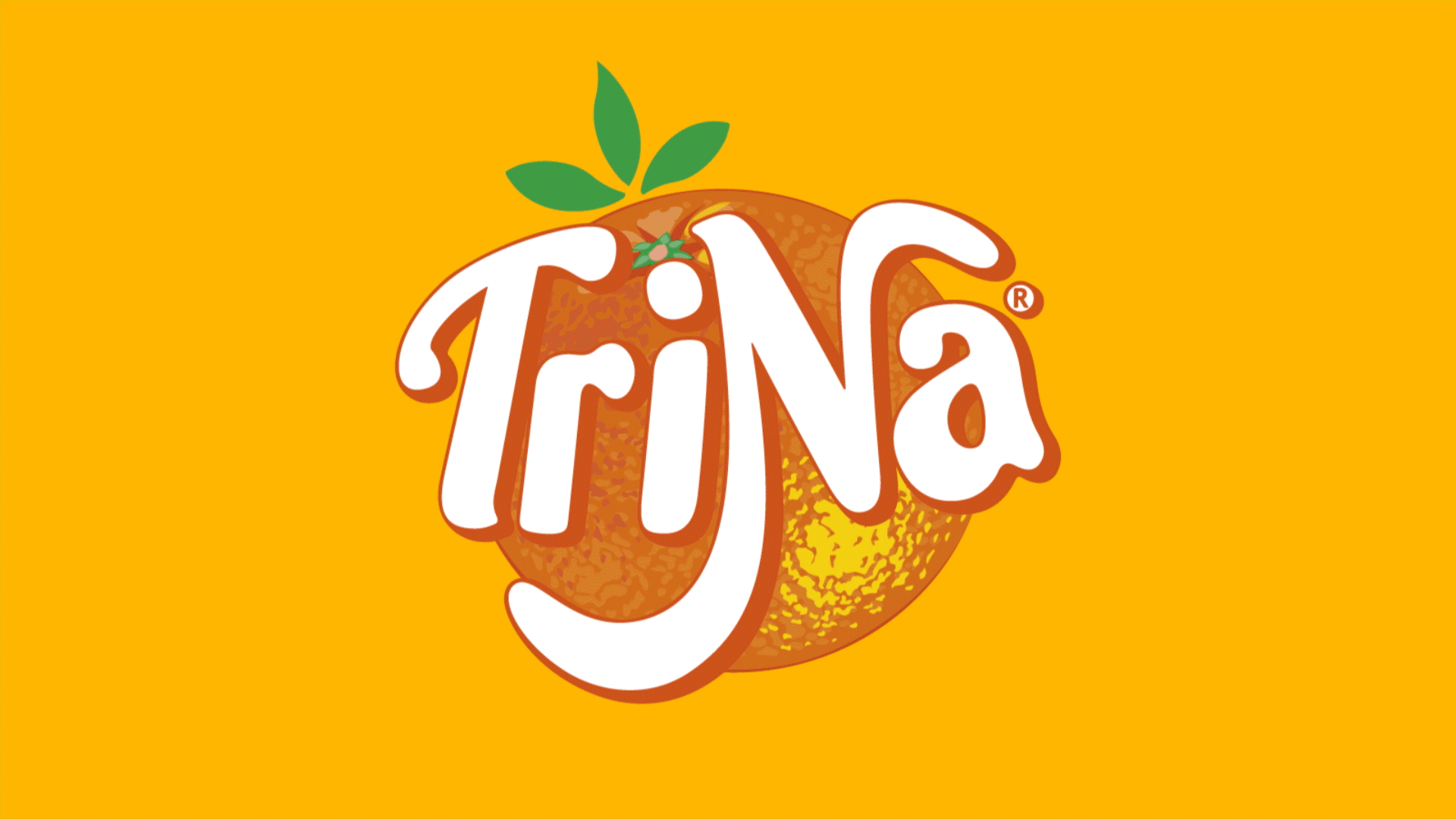
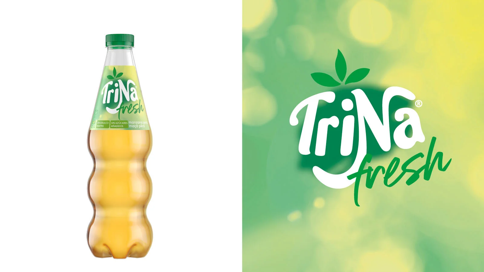
An expressive identity that returns to its origins
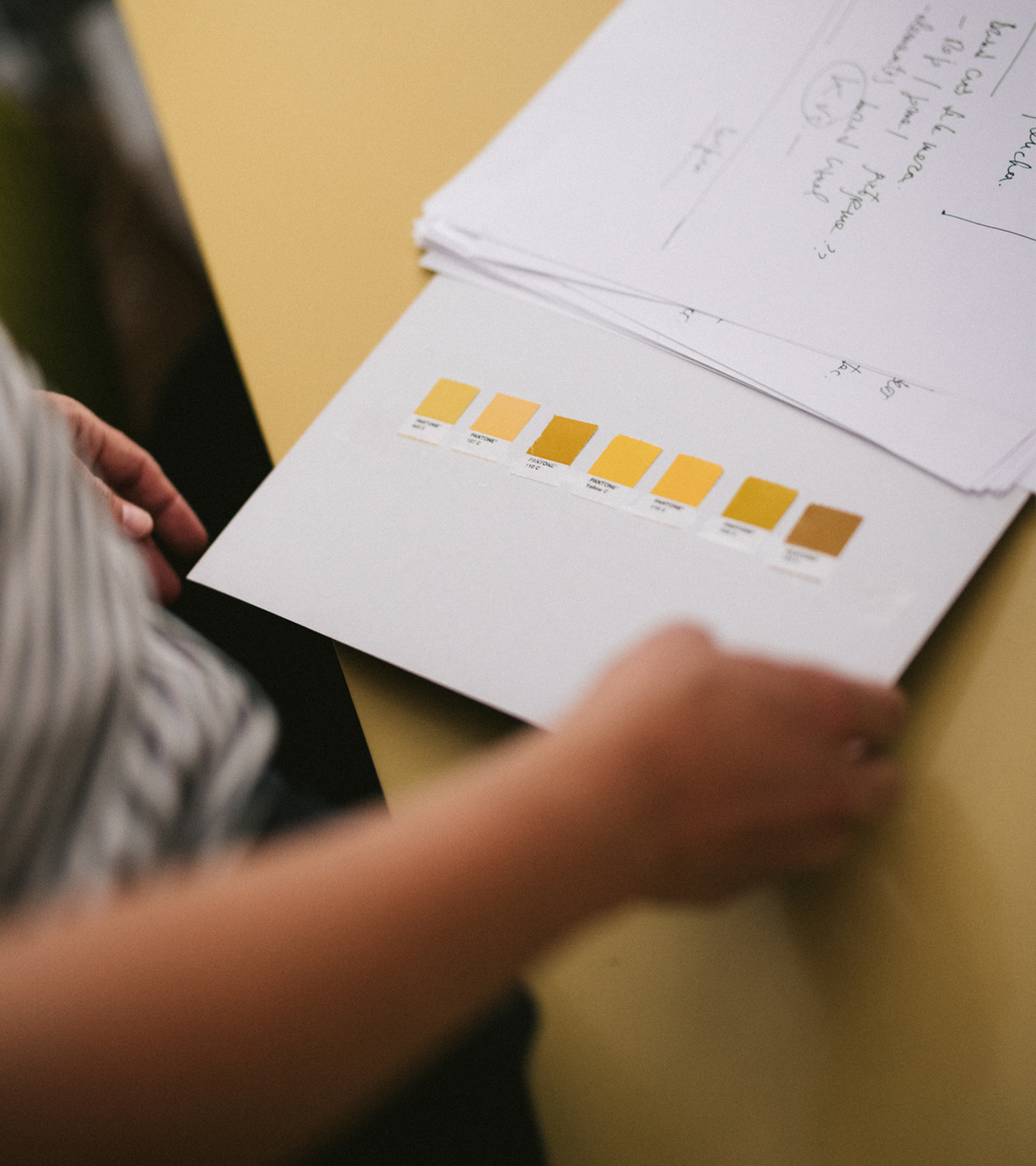
The evolution of the logotype and visual system takes inspiration from Trina’s legacy—its friendly, juicy, and playful character.
We developed a more balanced wordmark, with refined curves and stronger readability, paired with an iconographic system centered on fruit as a key identity element.
The orange —a historic symbol of the brand— regains texture, volume, and detail, creating a fresher, more natural graphic language.
A vibrant, saturated color palette and an amplified use of color allow the brand to communicate flavor, brightness, and optimism clearly across all applications.
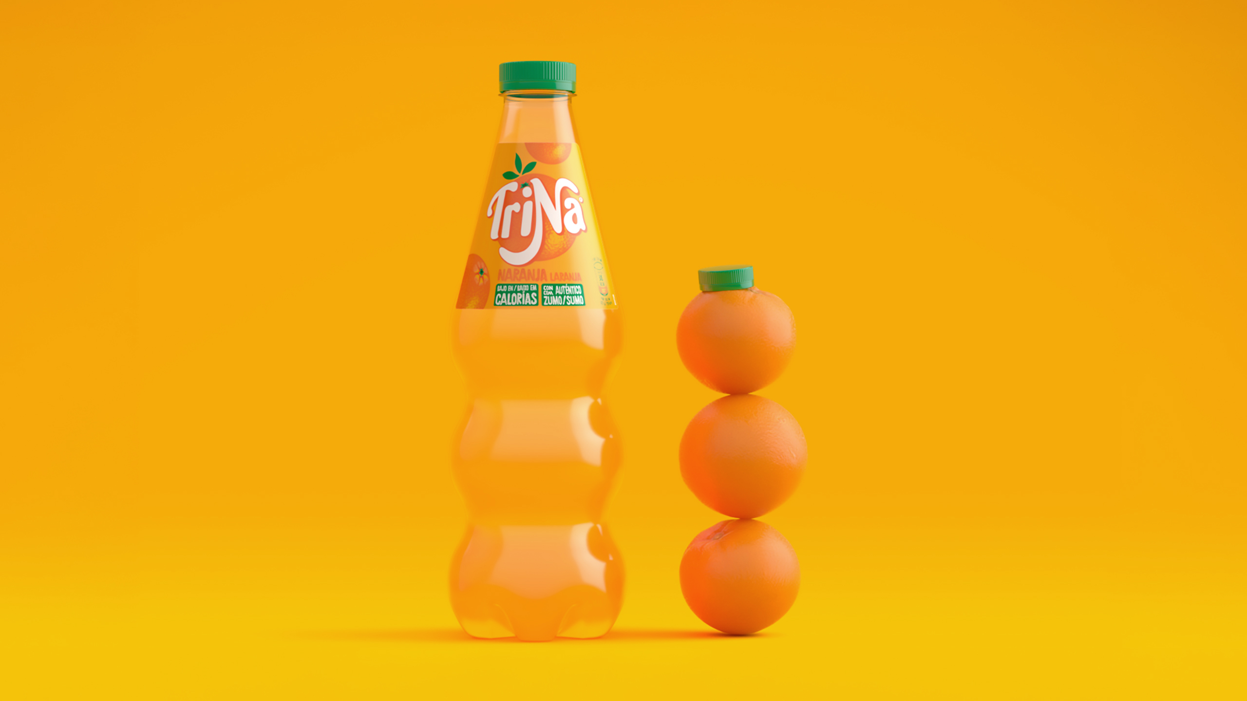
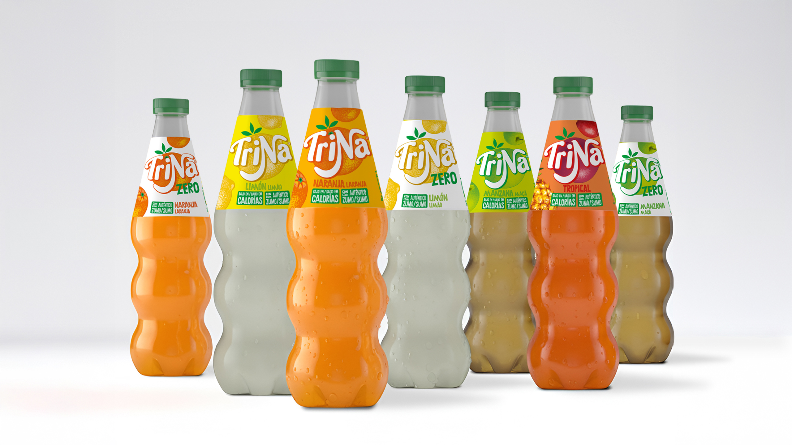
A new bottle designed as an icon
The industrial design of the new bottle is one of the pillars of the project.
Its silhouette, composed of three spherical modules, is a direct abstraction of the three oranges that have always accompanied Trina’s visual universe.
This geometry provides identity, ergonomics, and strong shelf presence.
The bottle is recognizable from any angle, conveys tactility, and turns the container into a distinctive element of the product itself.
A design that unites function and emotion: fruit becomes form, and form becomes a brand symbol.
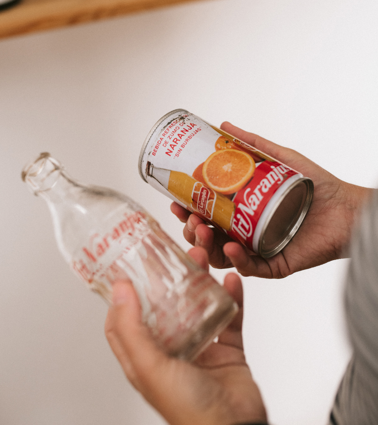
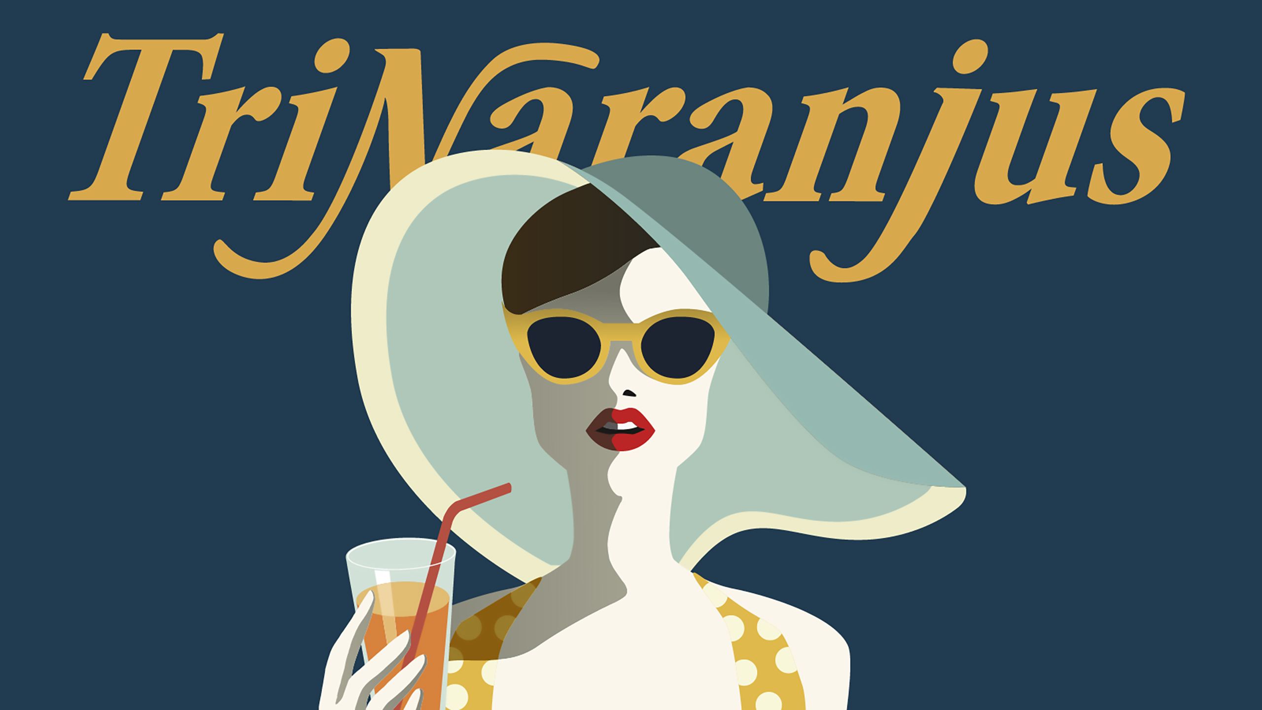
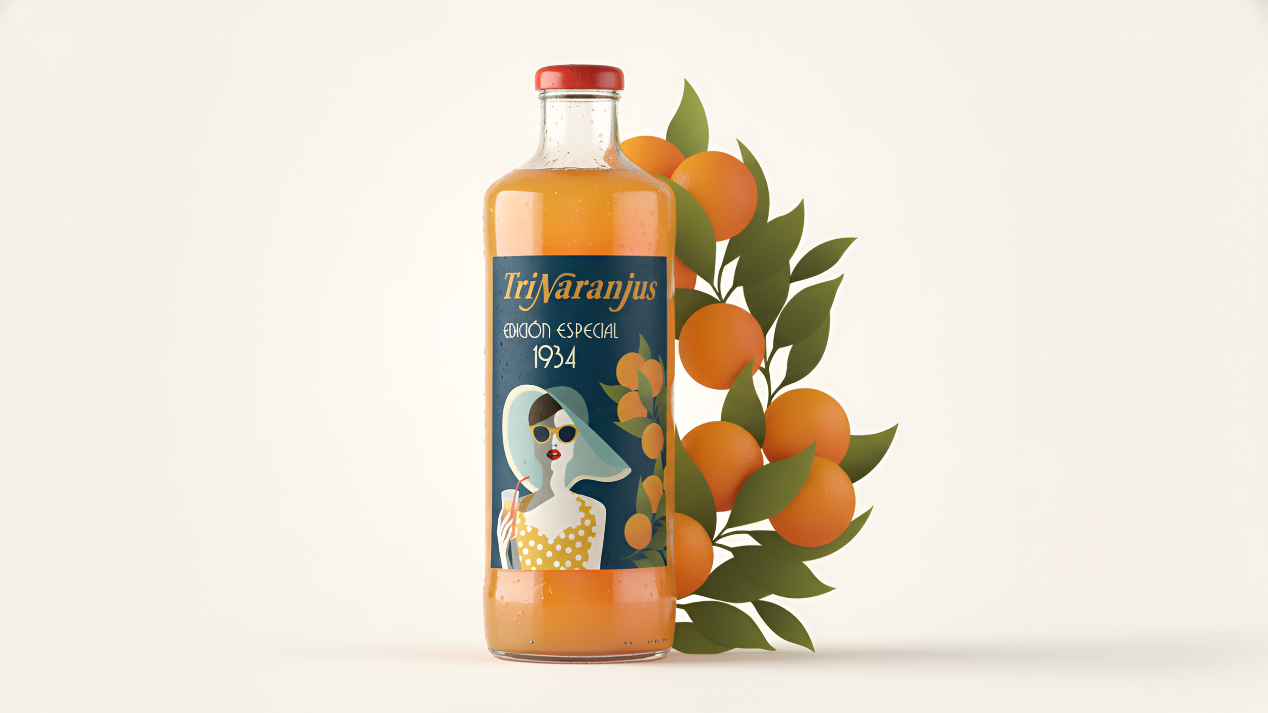
TriNaranjus 1934 Edition: activating memory through design
We also developed a limited edition that revives the brand’s original name, TriNaranjus, with a contemporary interpretation.
The main illustration—drawing on graphic languages from the 1930s—creates a summery, elegant, and evocative universe that connects the brand with its origins without falling into literal nostalgia.
The label functions as an homage to Trina’s visual heritage, adding sophistication and building a narrative bridge between past and present.
A punctual gesture that reinforces the brand’s historical depth and expands its expressive capacity.
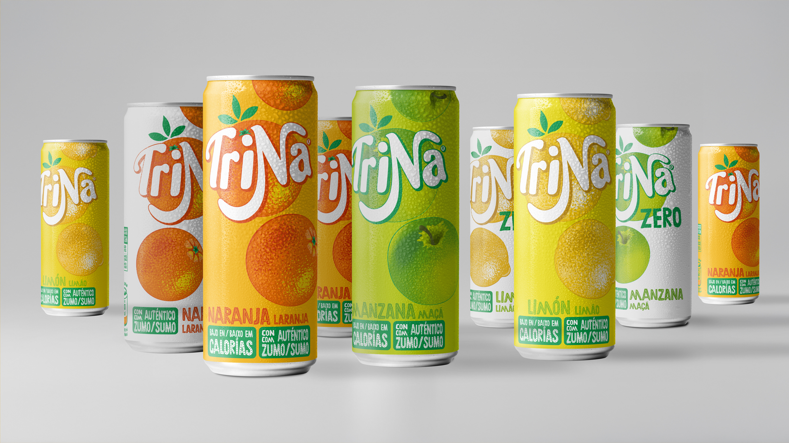
A system that combines heritage, freshness, and clarity
The new Trina establishes a cohesive and recognizable visual language aligned with its core essence: fruit, clarity, and enjoyment.
From the identity to the three-orange bottle and the vintage edition, the project consolidates a stronger, more expressive brand ecosystem ready to evolve.
Project:
Redesign of the Trina packaging range
Client:
Schweppes Suntory
Sector:
Beverages
Scope of work:
– Concept creation
– Industrial design
– Packaging
– Illustration
– Copywriting