

Schweppes Classics
Project:
Redesign of the Schweppes Tonic range packaging
Client:
Schweppes Suntory
Sector:
Beverages
Scope of work:
– Concept creation
– Packaging
– Illustration
– Copywriting
Three redesigns over 12 years to keep the essence of an icon alive
At NTITY, we have accompanied Schweppes on a path of continuous evolution, developing three key redesigns of the Original Tonic —and the rest of the range— to preserve its relevance in an increasingly dynamic market, without losing the authenticity that has made it a classic since 1783.
Each update brought a different challenge, but all shared the same objective: strengthening its heritage, improving shelf clarity, and updating its visual language to connect with new generations.
A first redesign to structure and modernize
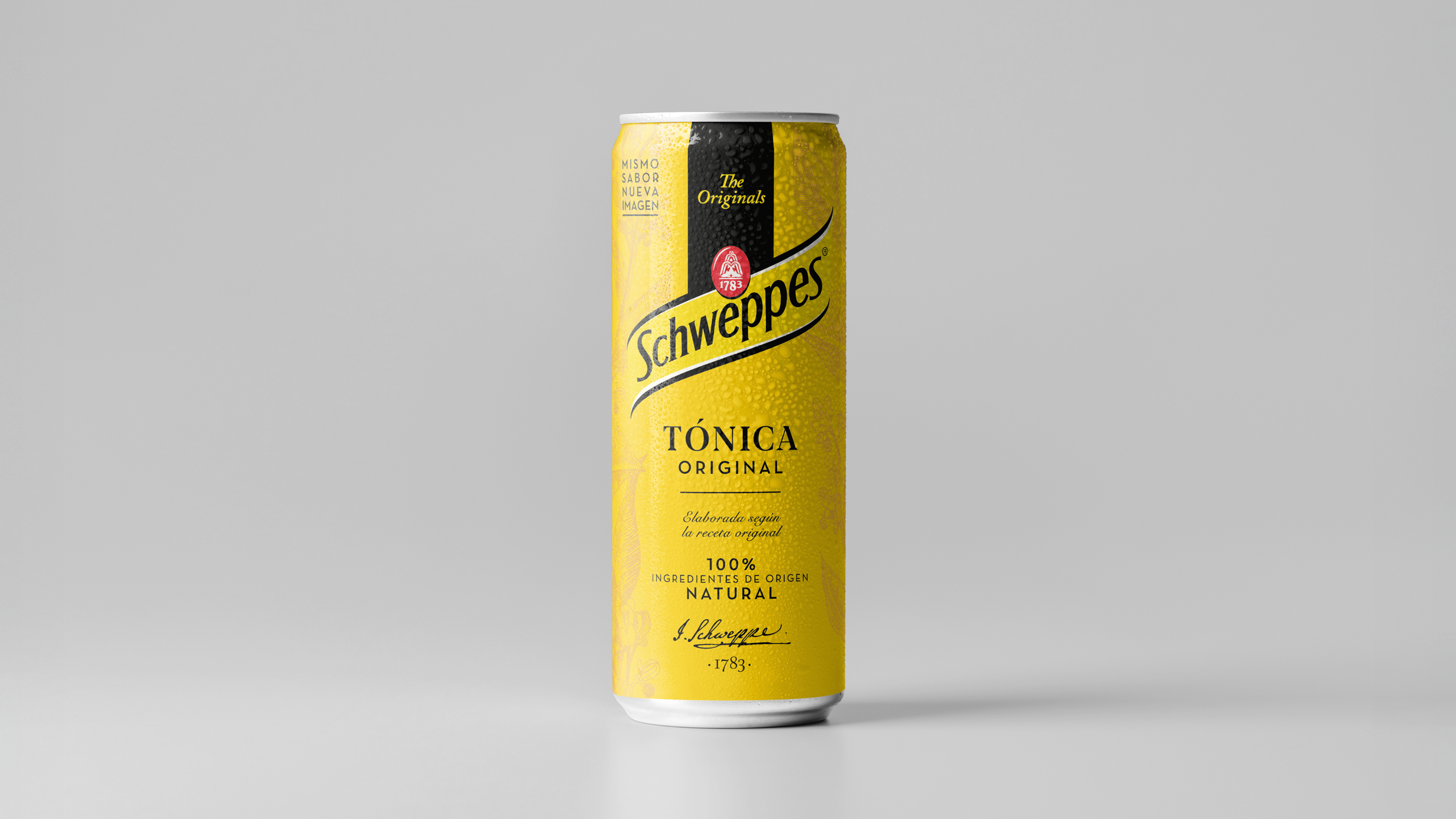
The first major exercise focused on organizing the front of pack, balancing hierarchies, and reinforcing the recognizability of Schweppes’ iconic yellow code.
The curved band —an unmistakable hallmark of the brand— was refined, the background was cleaned up, and the product description was made clearer, emphasizing its natural origin.
The result was a more orderly, effective, and contemporary look that preserved what consumers already identified as “the tonic of always.”
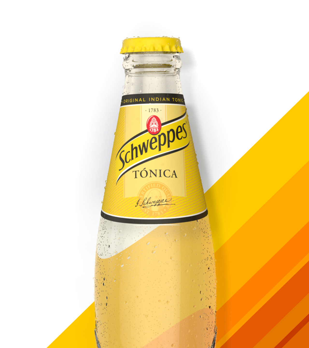
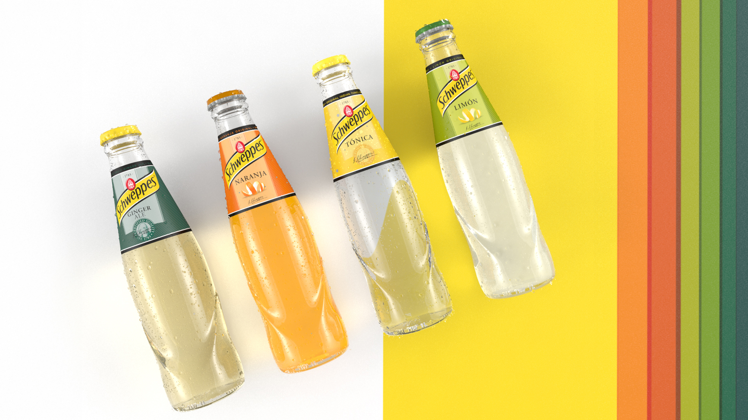
A second evolution centered on naturality
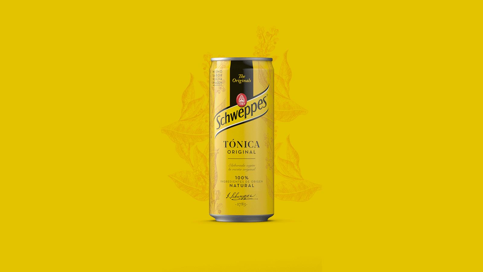
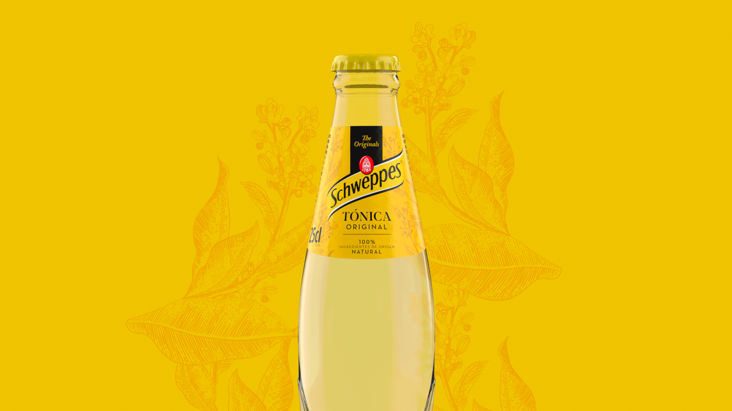
In the next stage, the brand asked to go further and introduce a richer graphic universe.
We incorporated botanical illustrations and a more expressive bubble texture, bringing the design closer to a natural territory without losing sophistication.
Color work became more precise, improving differentiation between variants and enhancing legibility across all formats: sleek can, standard can, and glass bottle.
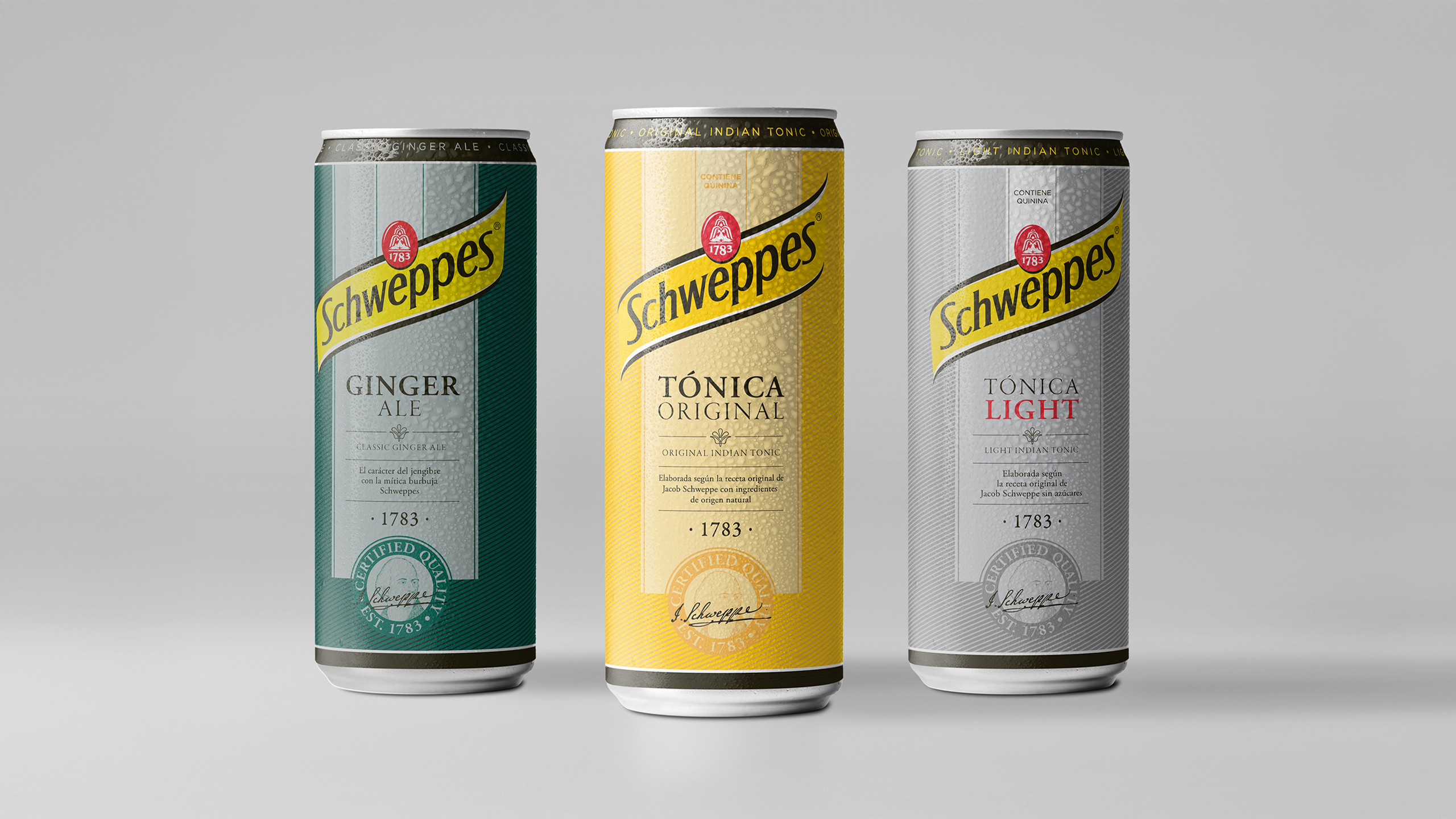
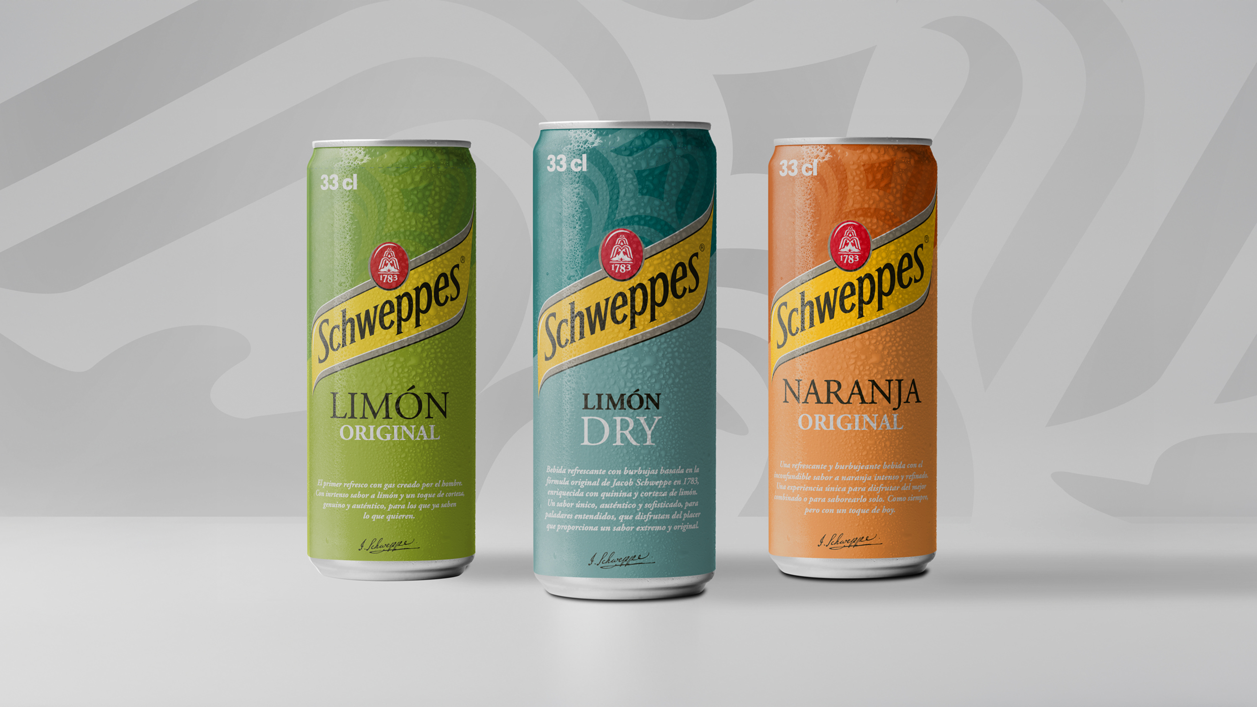
A third redesign for a broader and more coherent portfolio
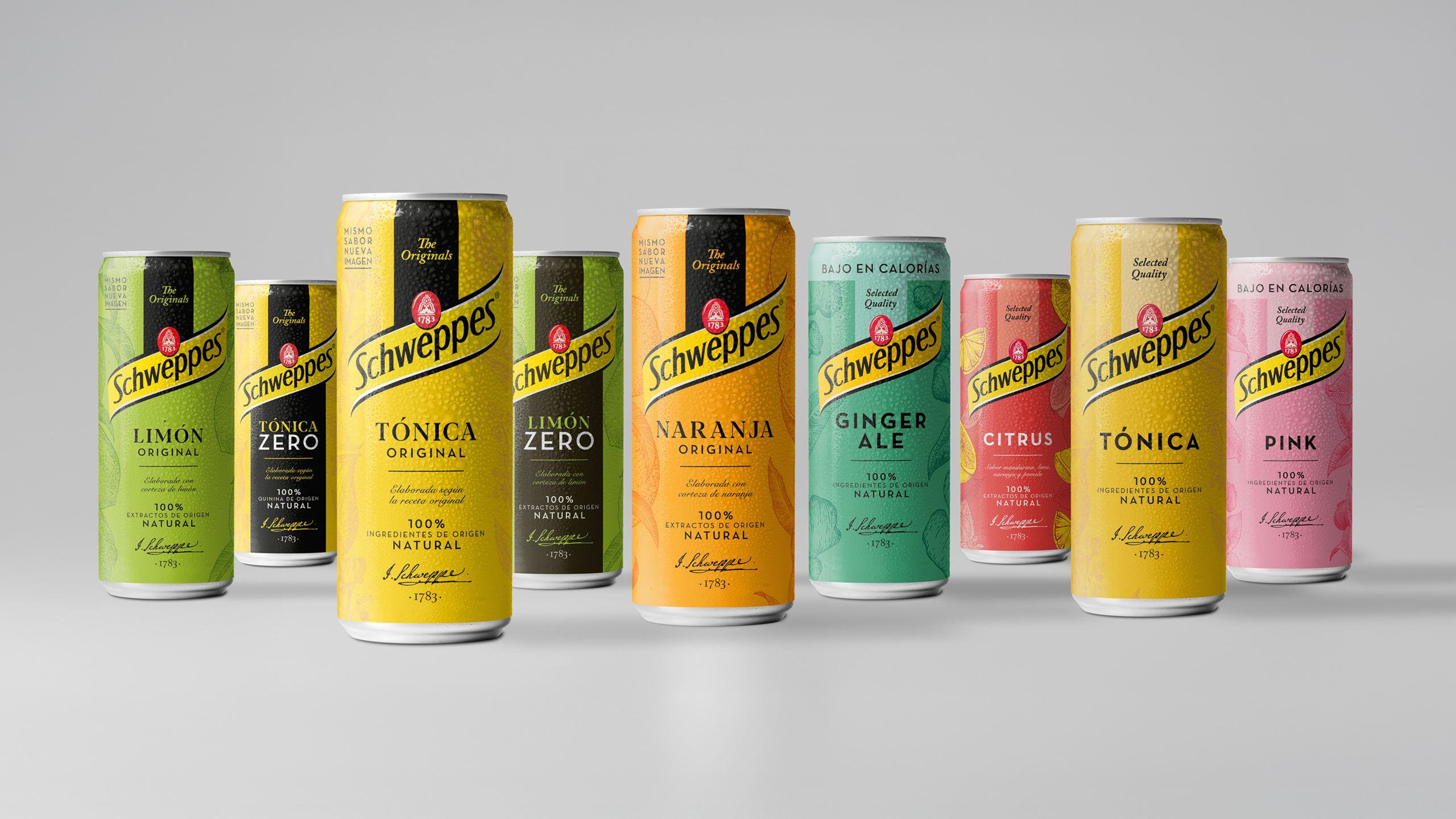
As the Schweppes family grew, a more robust system became necessary.
The third redesign focused on building a transversal visual language capable of articulating both the Original Tonic and the multiple extensions: Zero, Pink, Citrus, Ginger Ale, Lemon, Orange, and others.
The visual architecture was perfected, the yellow band was reinforced as a core identity element, and the 1783 crest gained presence to strengthen brand storytelling.
The result is a solid, harmonious, and highly recognizable range in any point of sale, capable of evolving without losing its essence.
A heritage that continues to evolve
Over the years, our collaboration with Schweppes has been about preserving the brand’s historic identity while adapting it to new aesthetic codes, new consumers, and new market needs.
Three redesigns, three different moments, one purpose: keeping alive the spark of an icon that is part of popular culture.
Project:
Redesign of the Schweppes Tonic range packaging
Client:
Schweppes Suntory
Sector:
Beverages
Scope of work:
– Concept creation
– Packaging
– Illustration
– Copywriting