
Orlando Creaciones Tomato
Project:
Redesign of Orlando Creaciones
Client:
Kraft Heinz
Sector:
Food
Scope of work:
– Concept creation
– Packaging
– Illustration
– Copywriting
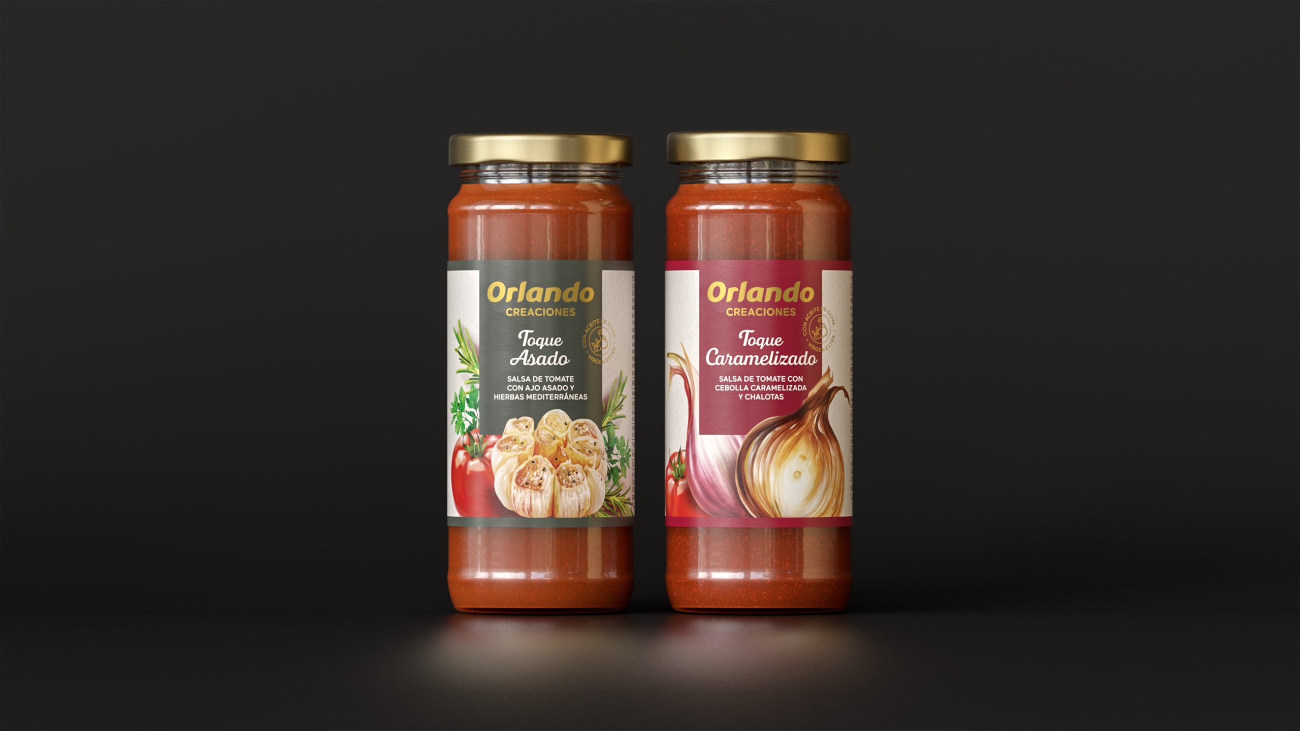
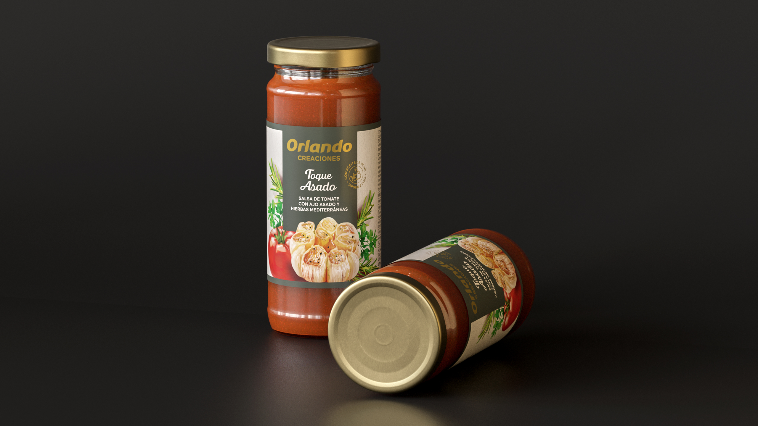
Orlando Creaciones: Bringing homemade flavor into a more culinary territory
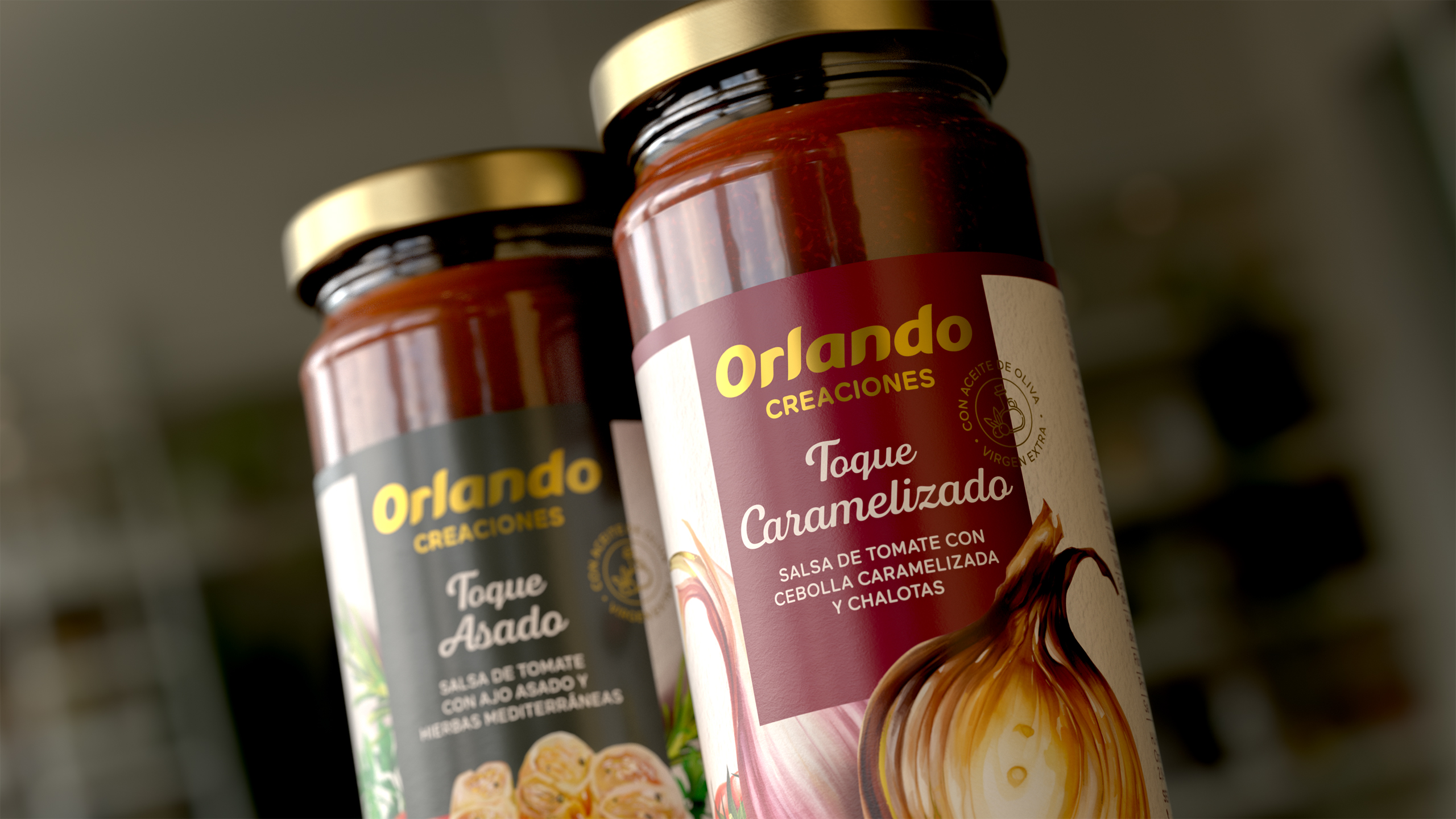
A more culinary and expressive visual territory
The core of the redesign was building a graphic language that would instantly convey flavor, creativity, and authenticity.
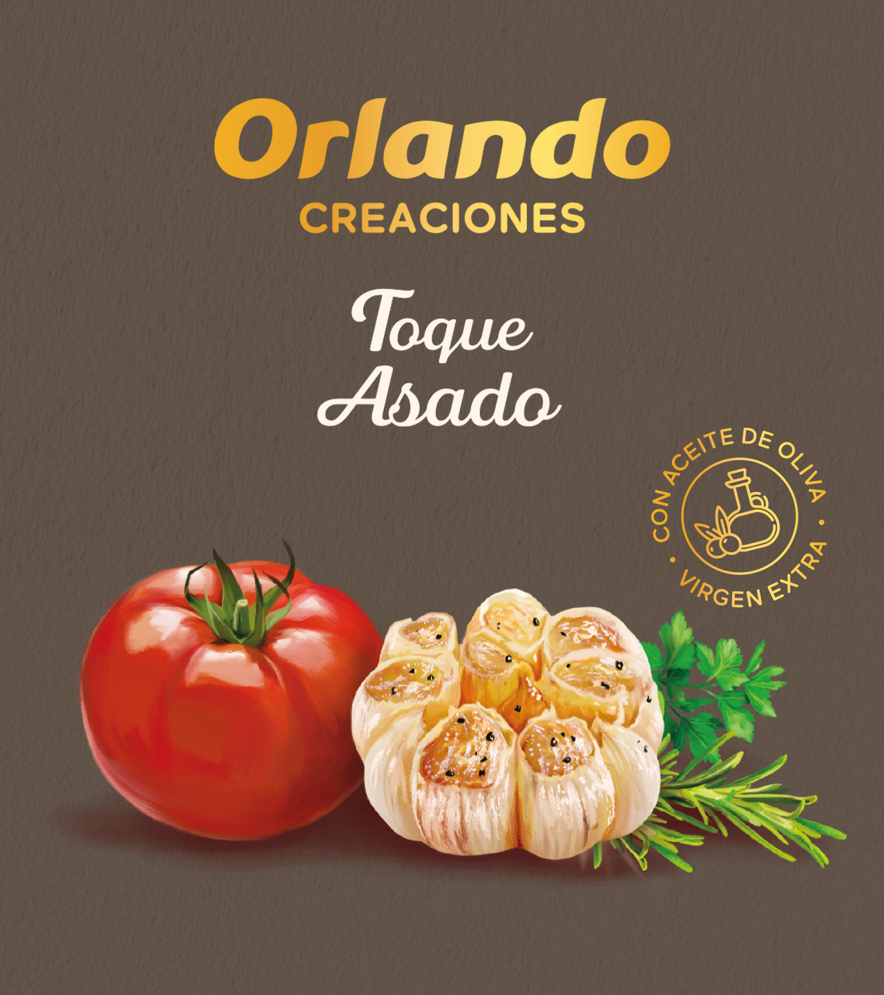
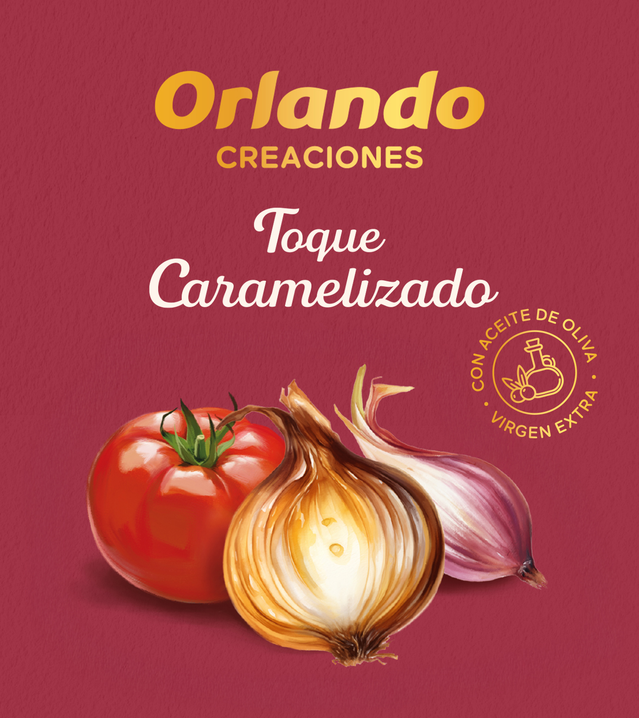
To achieve this, we incorporated hand-rendered ingredient illustrations with a painterly, textured style that brings realism and warmth.
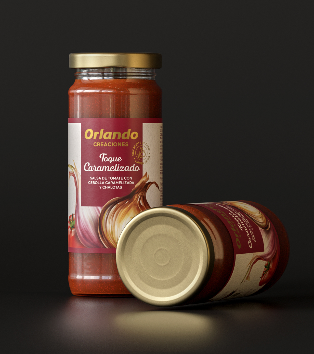
These ingredient scenes became the heart of each product, spotlighting roasted garlic, caramelized onion, or shallots as key visual protagonists—highlighting the homemade character of every preparation.
A clear and coherent architecture for the range
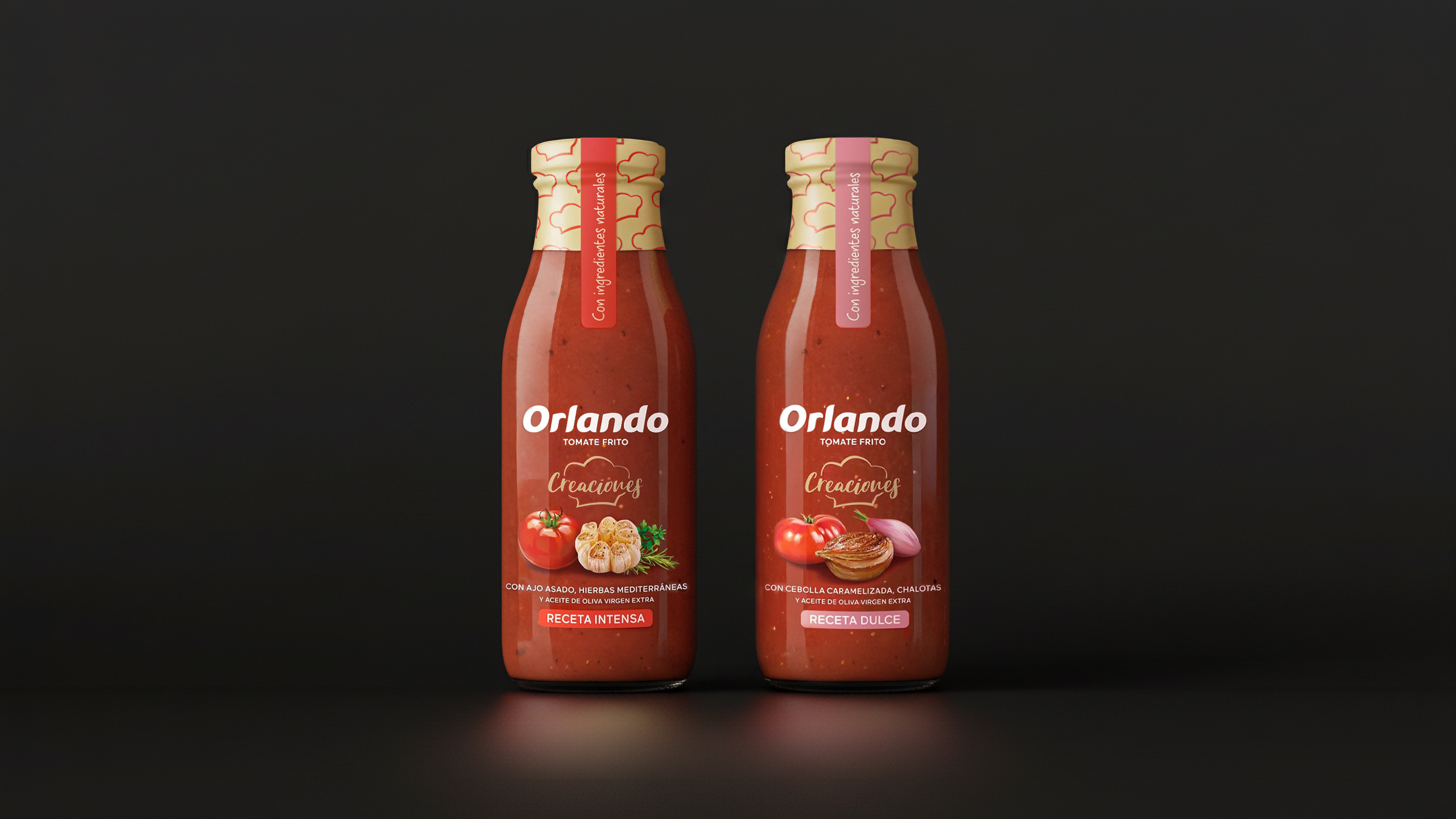
To ensure order and legibility on shelf, the front-of-pack hierarchy was reorganized:
– The brand takes on a stronger, more recognizable role.
– Recipe names are presented in a handwritten typeface that evokes the world of home cooking.
– The color palette is defined by recipe family, creating instant recognition between Toque Asado and Toque Caramelizado.
– The extra virgin olive oil seal was integrated as a key element reinforcing the product’s quality, adding value and coherence to the culinary narrative of the range.
An identity that elevates the fried-tomato experience
At NTITY, we approached this project as a transformation of a range with strong domestic heritage into a richer, more contemporary culinary proposition.
The new design strengthens Orlando’s personality, increases impact on shelf, and highlights the quality of recipes that celebrate flavor, slow cooking, and food made with care.
Project:
Redesign of Orlando Creaciones
Client:
Kraft Heinz
Sector:
Food
Scope of work:
– Concept creation
– Packaging
– Illustration
– Copywriting