


ACB
Project:
New brand
Client:
ACB, Spanish Basketball Association
Sector:
Sports
Scope of work:
– Concept
– Visual identity
ACB: A new identity for Spanish basketball
Together with China Ad Agency, we have renewed the brand image of the ACB, the Spanish Basketball Clubs Association, with the main goal of revitalizing and updating basketball’s visual identity. We have brought the ACB’s image closer to today’s digital world — to young audiences, the use of devices and new forms of communication.
We created a simple, direct brand that moves away from the clichés of traditional sports graphic language. We shifted from a symbol that depicted a player in motion to a brand with real movement, capable of evoking the core attributes of basketball: speed, surprise, impact. The ACB brand is action. Play. A dynamic, living, energetic, vibrant brand.
A more contemporary and dynamic brand
The new identity simplifies the historic jumping-player silhouette, transforming it into a clean and forceful typographic system, paired with an orange circle that synthesizes the essence of the game: the ball, movement, and the energy of basketball. The result is a more modern, adaptable, and powerful visual language in any digital or physical environment.
A versatile visual language
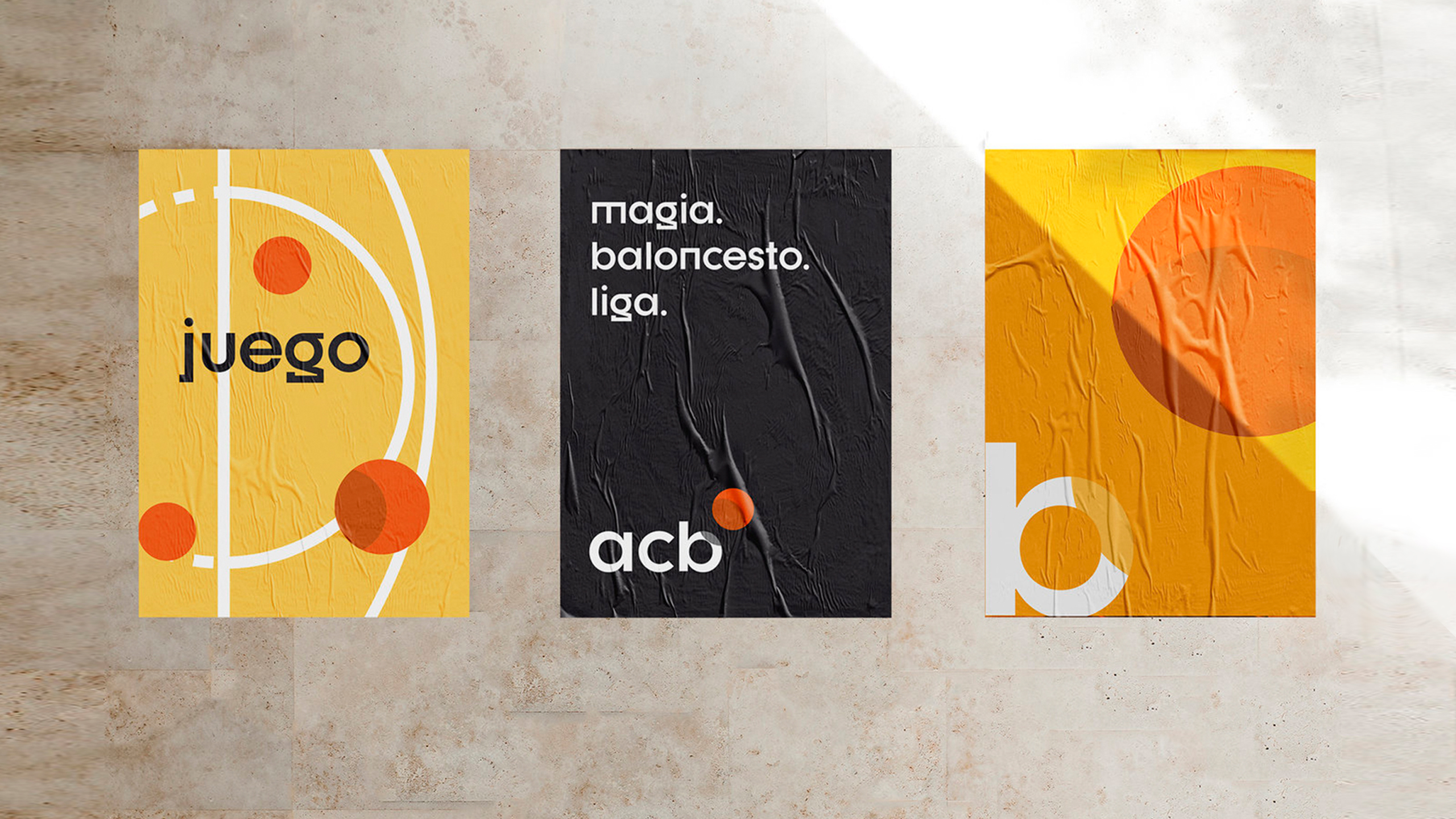
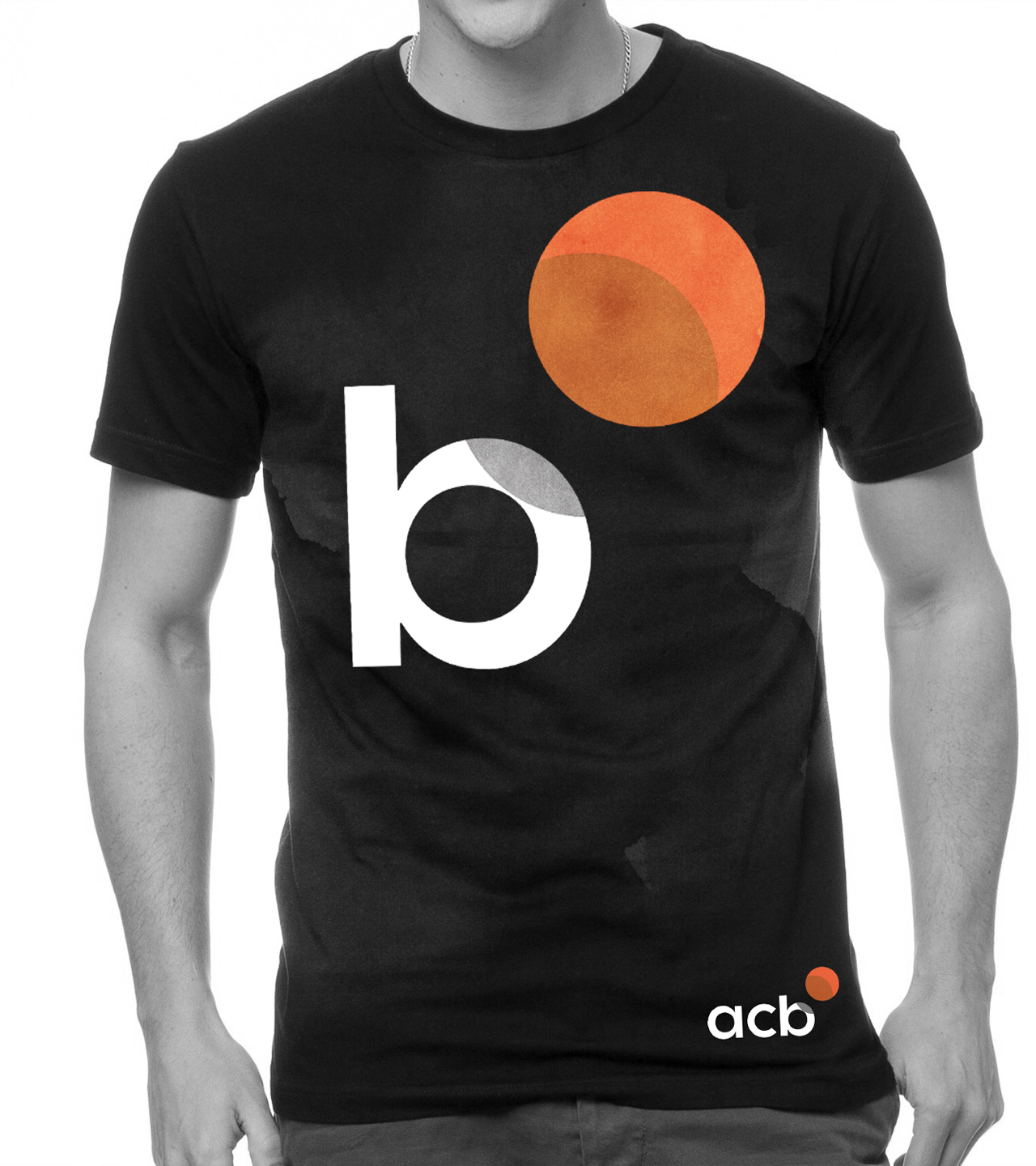
ACB is basketball. That’s why we turn the b into our symbol.
A distinctive, characterful typeface completes our graphic universe, making written messages stand out across all applications.
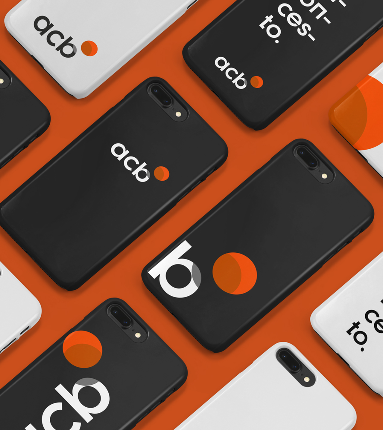
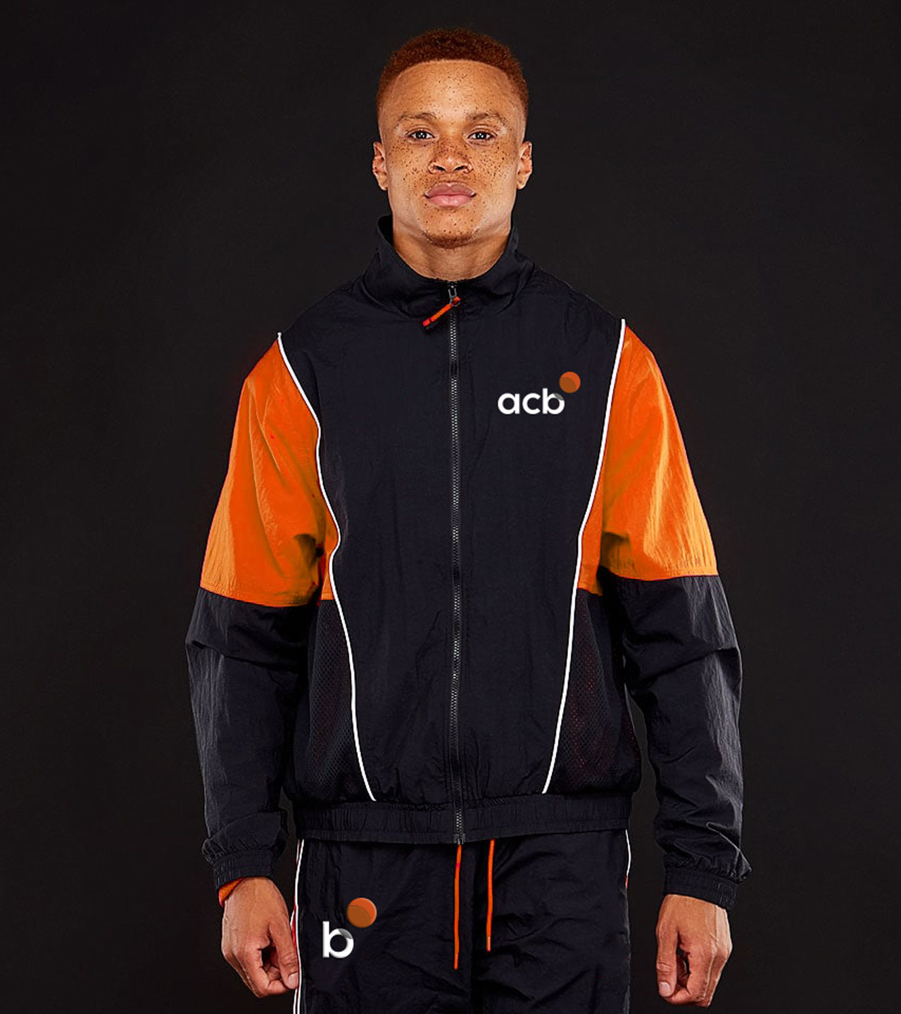
The redesign is supported by a modular, flexible graphic architecture that can be applied coherently across multiple media, from the court to merchandising to digital platforms.
The system is built on pure geometries and a reduced palette, where black, white, and orange construct a solid, elegant, and easily recognizable identity.
From symbol to movement
The new symbol works not only as a logo: it comes to life through motion, becoming a narrative element that conveys rhythm, play, and emotion.
This approach gives the brand a vibrant, contemporary presence designed to evolve alongside the sport.
We have created a simple, direct brand that breaks away from sports graphic clichés: the player silhouette from the previous logo is replaced by the simplest representation of a ball — an orange circle whose shadow enables visual play and movement that reflect basketball’s core attributes.
Project:
New brand
Client:
ACB, Spanish Basketball Association
Sector:
Sports
Scope of work:
– Concept
– Visual identity