

Olive Green
Project:
Branding and packaging for Extra Virgin Olive Oil in Canada
Client:
DeOleo
Sector:
Food
Scope of work:
– Concept creation
– Naming
– Brand image
– Packaging
– Illustration
– Copywriting
Olive Green: branding and packaging
At NTITY, we had the pleasure of developing the visual identity and packaging for Olive Green, a brand born with the mission of offering high-quality virgin olive oil to the Canadian market.
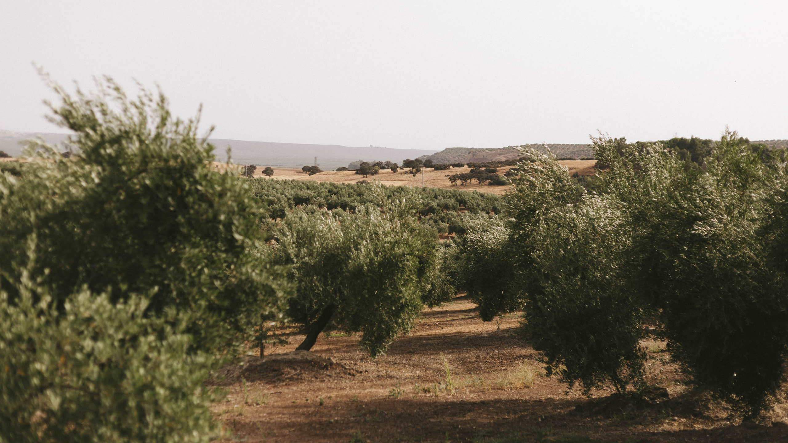
The project consisted of building a brand that conveyed freshness, authenticity, and a commitment to its origins, aimed at young consumers committed to healthy eating and the environmental protection, and who value naturalness, quality of origin, and excellence.
Strategy and Design
We started with a thorough analysis of the sector and consumer profile to create a strong and distinctive identity. The result is a concept and a name that connects the product with the vitalist attitude of those who care about their health and the environment.
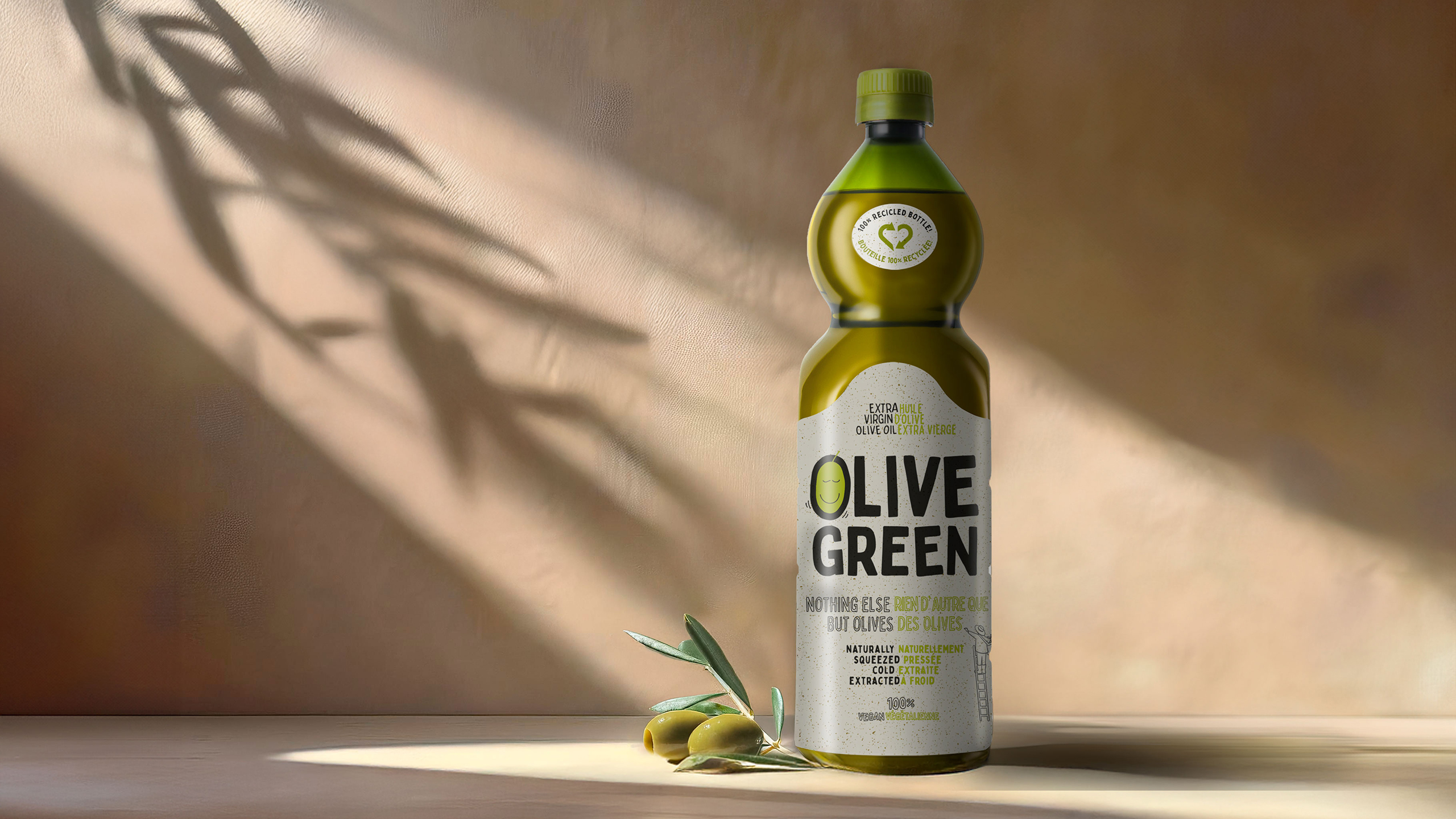
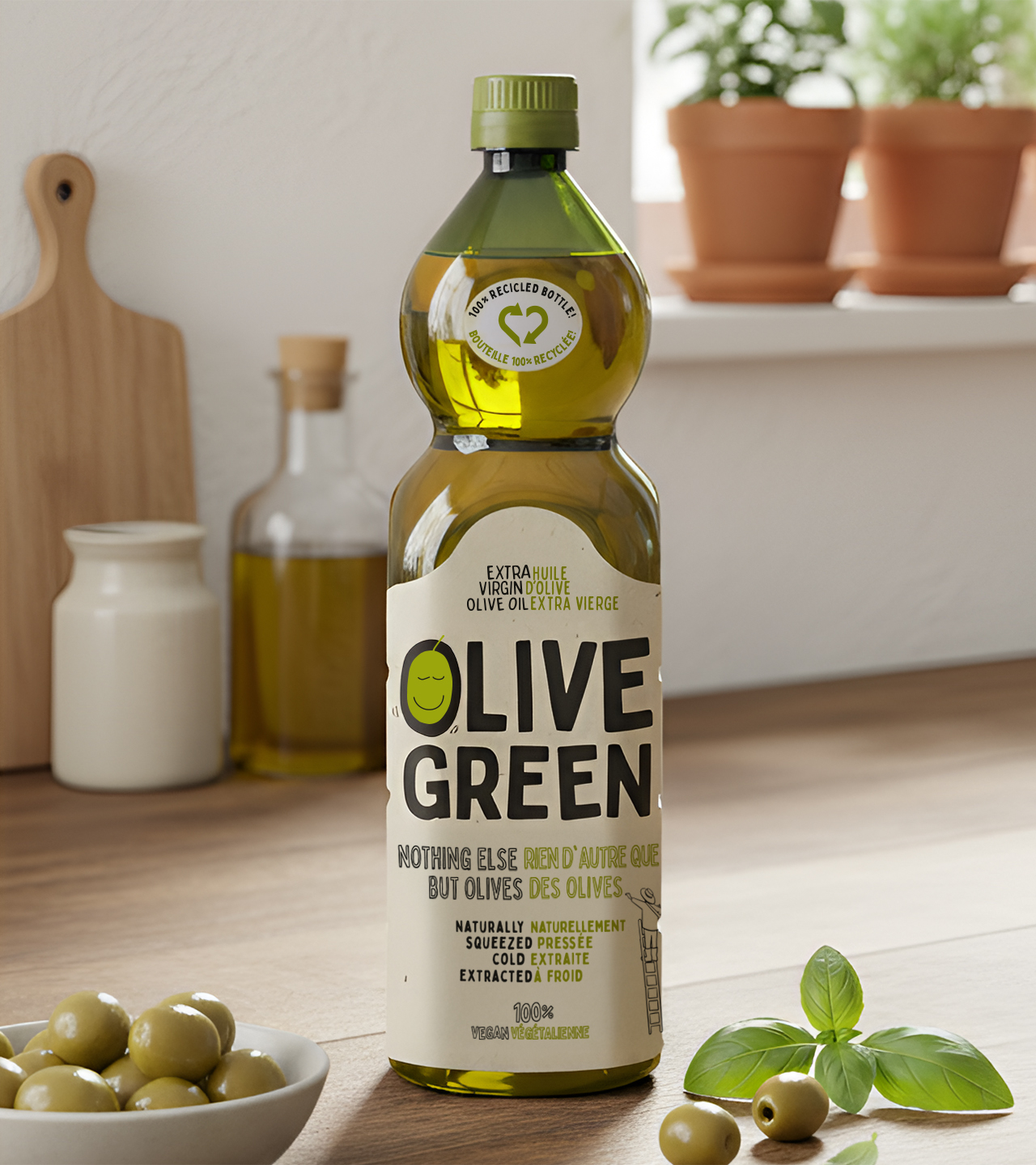
Olive Green’s image reflects purity, closeness, and sustainability. Its style is simple and friendly, using illustration as its main graphic element.
With a casual aesthetic in natural tones, the design conveys authenticity and confidence, and details such as the smiling olive and the figure on the ladder add a human touch and evoke the tradition and care taken in its creation.
Results
Olive Green’s new identity connects with its audience thanks to its clear, coherent, and memorable image, strengthening its position in a competitive market and aligning itself with the values of sustainability and health that define the brand.
Project:
Branding and packaging for Extra Virgin Olive Oil in Canada
Client:
DeOleo
Sector:
Food
Scope of work:
– Concept creation
– Naming
– Brand image
– Packaging
– Illustration
– Copywriting